Free menu engineering template
Which dishes earn their place on the menu — and exactly what to do about the ones that don’t.
Costing tells you what a dish makes. Menu engineering tells you what to do about it. Plot every item on two axes — how popular it is, and how much contribution margin it earns — and the menu sorts itself into four groups, each with a different answer.
Download the menu engineering sheet
.xlsx — 40 dishes, automatic classification, colour-coded
⬇ Download free — no email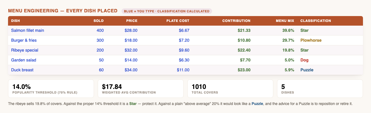
The four groups
| Type | Meaning | What to do |
|---|---|---|
| Star | High profit, high popularity | Protect it. Keep quality and portion absolutely consistent, hold its place on the menu, never discount it. |
| Plowhorse | Low profit, high popularity | People love it and it barely pays. Cut plate cost before you touch the price — portion, garnish, a cheaper cut — or raise the price in small steps and watch covers. |
| Puzzle | High profit, low popularity | It earns well when it sells. Move it to a better spot, rename or describe it better, train staff to recommend it. If it still won’t move, retire it. |
| Dog | Low profit, low popularity | Cut it — unless it serves a purpose the numbers can’t see, like a dietary requirement or an ingredient another dish depends on. |
The threshold most free templates get wrong
An item counts as “popular” if its share of covers reaches 70% of an equal share. With five dishes an equal share is 20%, so the line sits at 14% — not 20%. Plenty of free templates simply test against the average instead. It looks like a reasonable simplification. It isn’t.
Here is what that shortcut costs you. In the example inside the file, the ribeye sells 19.8% of covers and earns $22.40 a plate.
Under the proper rule it clears the 14% line and is a Star — protect it, don’t discount it, don’t touch it.
Under “above average” it misses the 20% line and looks like a Puzzle — and the standard advice for a Puzzle is to reposition or retire it.
Same dish, same numbers, opposite instructions. That is how a menu quietly loses one of its best sellers to a rounding rule.
What the sheet works out for you
- Contribution margin per dish — menu price minus plate cost. The number that actually pays your rent.
- Menu mix % — each dish’s share of total covers.
- The 70% popularity threshold, recalculated automatically as you add or remove dishes.
- Weighted average contribution margin — weighted by units sold, not a plain average of the column, which is a second thing templates commonly get wrong.
- Automatic classification, colour-coded: green Stars, amber Plowhorses, blue Puzzles, red Dogs.
- Room for 40 dishes, plus the recommended action for each group written into the sheet.
Why contribution margin beats food cost percentage here. A $34 duck at 32% food cost contributes $23.12 a plate. A $14 salad at 45% contributes $7.70. The salad has the worse percentage and the worse cash return — but percentages alone would have you chasing the wrong dish. Menu engineering ranks on the cash.
How to use it
- Pull units sold per dish for a real period — a month is usually enough, a quarter is better.
- Enter the menu price and an accurate plate cost. If your plate costs are guesses, fix that first with the plate cost calculator and recipe costing sheet — menu engineering built on bad costs just gives you confident wrong answers.
- Read the classification column and work top-down: Plowhorses first (most volume, least margin), then Puzzles.
- Re-run it after any menu or supplier price change.
Common questions
How long a period should I use?
Long enough to be representative — a month minimum. A single busy weekend will flatter whatever was on special.
My plate costs are rough. Does that matter?
Enormously. Every classification depends on contribution margin, so a wrong plate cost puts the dish in the wrong box and you act on it. Cost the dishes properly first.
Does it work for drinks?
Yes — the maths is identical. Many bars find their classifications more lopsided than their kitchens.
Is anything I type sent anywhere?
No. It’s a file on your computer. This site has no trackers, no analytics and no cookies.
And for the business-level view, the weekly prime cost tracker — food plus labour against sales.
Start here if your costs aren’t nailed down yet: the free plate cost calculator and recipe costing spreadsheet.
Want this done for your actual menu?
This template does the classification properly, and it is free. If you would rather hand over the sales mix and the invoices and get the finished analysis back — every dish costed at true yield, contribution margin in dollars, and a list of what to reprice or cut — that is a paid service: the Menu Profitability Teardown →